POS Benchmark, Traffic Light Filters & More
01.04.2026
This release brings several enhancements across the POS Insights and OTC Performance Tracker. A new benchmark function and traffic-light filter are now available in POS Insights, alongside weekly growth values in the value table. The OTC Benchmark has been extended with a growth toggle and a TOTAL row for a more flexible analysis.
POS Benchmark in the Performance Tracker
In addition to the OTC Benchmark, a benchmark function is now also available in the POS Performance Tracker. This allows up to six selections – including products, product groups, brands, companies, a mix of multiple elements (virtual market), or a custom market definition – to be compared directly.
The analysis is displayed in a line chart, complemented by a value table, and covers a freely selectable period of up to 12 months (52 weeks) for a selected KPI within one of the 13 available shops. (see image 1)
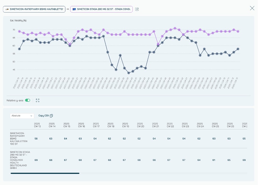
Image 1
How to benchmark
Access the feature via the Benchmark button in the Performance Tracker. After selecting KPI, one shop and a time period, up to six selections can be defined and compared over time. (see image 2)
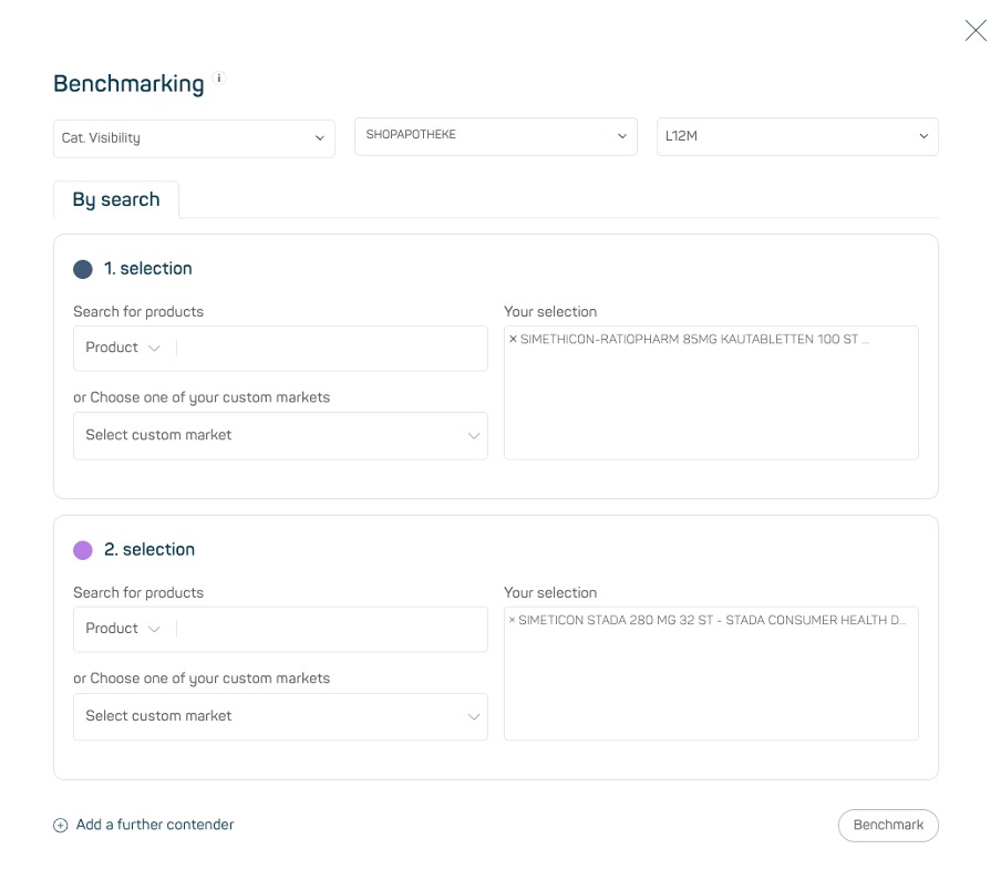
Image 2
KPI, shop, and time period can be adjusted at any time during the benchmark. The visualization and value table update automatically, allowing for a flexible and uninterrupted analysis.
Value tables and direct Copy2CSV export
In addition to the visualization, a value table displays all underlying metrics in a structured format. It can be exported via Copy2CSV in just a few clicks and used directly for further analysis, presentations, or internal reporting.
Traffic Lights Filter in POS Content & Quality Control
In the POS Content & Quality Control section, a new traffic-light filter enables a quick assessment of product presentations across all shops. Products are visually categorized into three statuses – from „all good“ to „critical“ need for action. (see image 3)
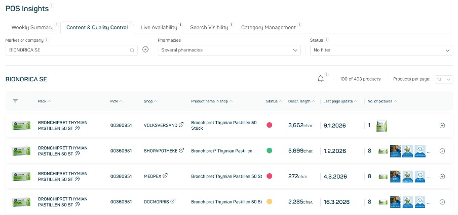
Image 3
Evaluation logic for product data
The baseline for evaluating product information is the average value of each KPI across all shops. This benchmark is used to measure how strongly each shop deviates from the overall average.
Depending on the level of deviation, each metric is marked as follows:
- Green (all good): deviation is < 25%
- Yellow (attention): deviation is ≥ 25%
- Red (critical): deviation is ≥ 50%
An overall product rating is then derived from these KPI-level result
- If one metric is rated yellow, the product is marked yellow overall.
- If two metrics are rated yellow, the product is marked red.
- If one metric is rated red, the product is marked accordingly.
This allows you to identify weaknesses in your portfolio at a glance and prioritize them effectively – without the need for deep-dive analyses.
Growth values in the value table of the POS Performance Tracker
The value table in the POS Performance Tracker has been extended with an important additional perspective: alongside absolute metrics, weekly growth values (YOY) can now be displayed on product groups and product level. (see image 4)
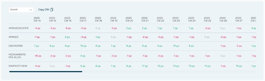
Image 4
This makes it easy to see at a glance how metrics develop compared to the previous year. Changes are displayed depending on the KPI – in percentage points (Category Visibility, Availability and Rebates), percentages (rAVP), or as absolute differences (Ratings and No. of Ratings) – ensuring an intuitive and context-appropriate interpretation.
These values can also be exported via Copy2CSV and used directly for further analysis or presentations.
OTC Benchmark – Growth Toggle & TOTAL Row
The OTC Benchmark has been extended with two enhancements that make working with charts and value tables more flexible and efficient.
Growth Toggle
After benchmarking, a new toggle button allows growth values to be activated or deactivated directly within bar and line charts. This gives full control over the visualization – switch between a clean absolute view or a combined view including growth trends, depending on what the analysis requires. (see image 5)
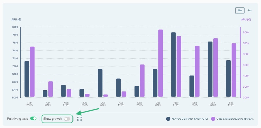
Image 5
TOTAL Row in the Value Table
The value table of the stacked bar chart (absolute) now includes a TOTAL row, displaying the combined sum of the primary and secondary selection. No manual calculation needed – the overall picture is visible at a glance. (see image 6)
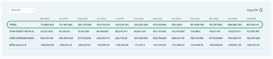
Image 6