New Benchmark for OTC Maps
26.05.2026
With the latest update, benchmarking comes to OTC Maps. Where is Brand A stronger than Brand B and where does the picture reverse? What was previously not visible directly on the map can now be analyzed region by region: for each federal state or 2-digit postal code area, a clear winner is determined. The selection with the higher KPI value wins the area and is highlighted directly on the map in the corresponding color. The selection that wins the most regions takes the crown.
How it works
The benchmark is started via the Benchmark button, where two selections can be defined (options: Company, Brand, Product Group, or Product). By default, the benchmark starts with the most recent month, the Federal States map level, and APU as the active KPI.
Once started, the map updates accordingly and highlights the winning regions visually for each selection (see image). On the left, a summary shows how many regions each selection has won. On the right, the overall figures for Germany are displayed side by side: selected KPI, Active Customers, Share selection vs. total market, and the respective YoY change rates. Clicking on a region opens the same information at area level.
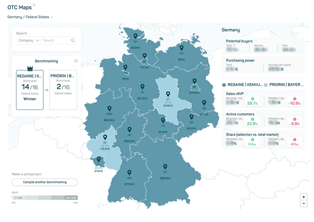
Image 1
The benchmark stays flexible
The map level can be switched at any time between Federal States and 2-digit postal code areas. The KPI can also be adjusted at any time – available options are APU, rAVP, and Units, each for LM, L3M, YTD, and MAT. Via Time Travel, a different reference period can be selected, making it possible to run the comparison not only for the current state but also for any point in the past.