Aggregation functions in the Performance Tracker, preview of configurations in Custom Download area, and improved Navigation
17.07.2024
The latest update in the Insights Hub allows you to aggregate (Sum, Mean, and Cells) values within the Performance Tracker’s value table a la Excel. Another update targets the Custom Download area. You can now see the dataset related to the download that you have previously downloaded or saved as a configuration. The download configurations saved can now be previewed. In addition, a new Menu has been implemented in the Insights Hub and the Main Navigation has been updated to optimize navigation.
Aggregations in Performance Tracker’s Value Table
You can now select the values in the Performance Tracker’s table (OTC tab), which can be opened and closed below the bar or line graph and conduct simple aggregations. The values in the table correspond to those in the graph. This means that the KPIs you select in the Performance Tracker (e.g. APU, rAVP, Unit, rAVP YTD, etc.) can also be found in the table.
What aggregations are possible?
In this table you can select the values of the last 3 years from January to December. The available aggregation functions are (as in Excel): Sum, Mean and Cells.
- Sum function: This function adds up all the selected values in the table. It is particularly useful for calculating the total amount over a certain period. This gives you a clear overview of the totals of your data.
- Mean function: This function calculates the average (arithmetic mean) of the selected values. This helps you to calculate an average value for the selected time periods, which can be useful to see trends and developments, for example.
- Cells function: This function shows the number of selected values in the table. This gives you a quick overview of how many data points are included in your analysis, which can be helpful when interpreting the results.
Example of an aggregation
Assume you have created a custom market that contains several analgesic products. If you now go to the Performance Tracker in the Market Overview and select the „rAVP“ metric, you can expand the table below the bar or line graph and see the values for the custom market as numerical values. You can now click on these values (see image 1). In this example, we select the values for April of the years 2022, 2023 and 2024. By clicking on them, all selected values are totaled (Sum) and averaged (Mean). At the same time, you can see in Cells that 3 values have been selected in total. This allows you to perform quick calculations in the Insights Hub without having to copy the values into Excel. By clicking on the values again, they are deactivated again and are therefore no longer included in the calculation.
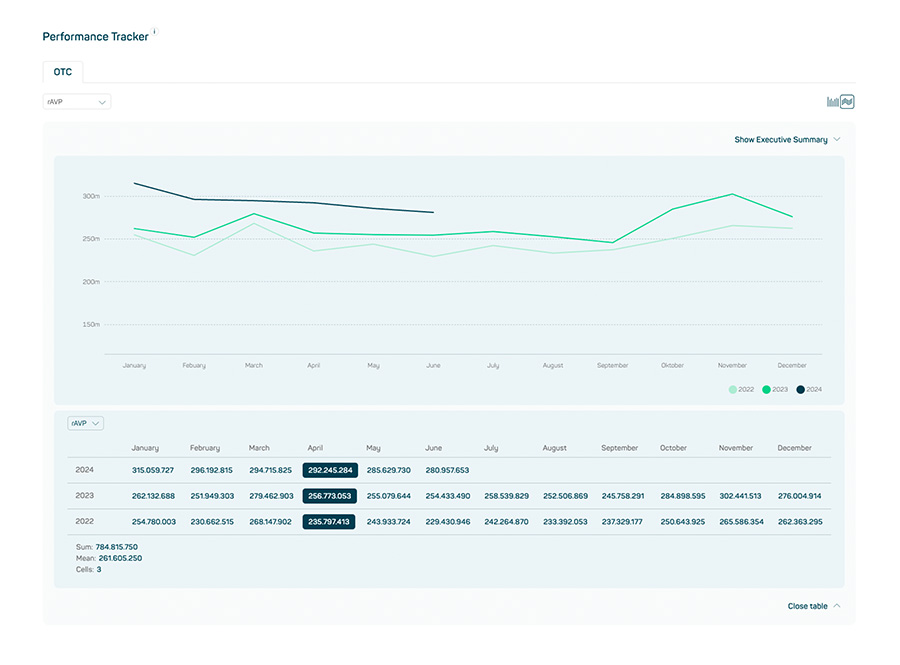
Image 1
Preview of configurations in Custom Download area
In the Custom Download area, you can choose your desired dataset as usual (e.g. OTC Insights) and then select and save your configurations. If you export the desired data set with your configurations, you will now also see it in the Download History (see image 2). This gives you a quick overview of the latest downloads.
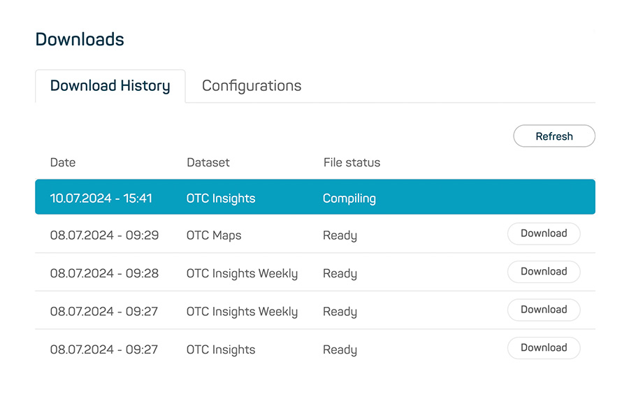
Image 2
In addition, you can now check which configurations you have saved under the „Configurations“ tab. Simply click on the eye symbol to open a summary of the saved configurations (see video). You can then load these configurations (using the „Load“ button to the right) and adjust them as needed or export them without making any new adjustments.
You can also access both new functions in the custom download area under „My downloads“.
New Menu for faster navigation in the Insights Hub
Throughout the Insights Hub, you will now find a so-called Canvas Menu on the left-hand side. You can use this menu to navigate through the Insights Hub and show and hide it as desired. This allows you to switch between the different modules at any time and quickly navigate to the important pages of the Insights Hub (e.g. Overview, Market Overview, Company Overview, Downloads, Daily Sales Data, Persona Explorer).
Furthermore, you can also use the Canvas Menu to navigate quickly within a page, e.g. in the Market Overview to the List/Tiles Navigation, to the Performance Tracker or to the Market Ranking (see image 3). In addition, a sub-menu „Product Page“ is displayed on a Product Details page, allowing you to navigate through the page via the Canvas Menu (see image 4).
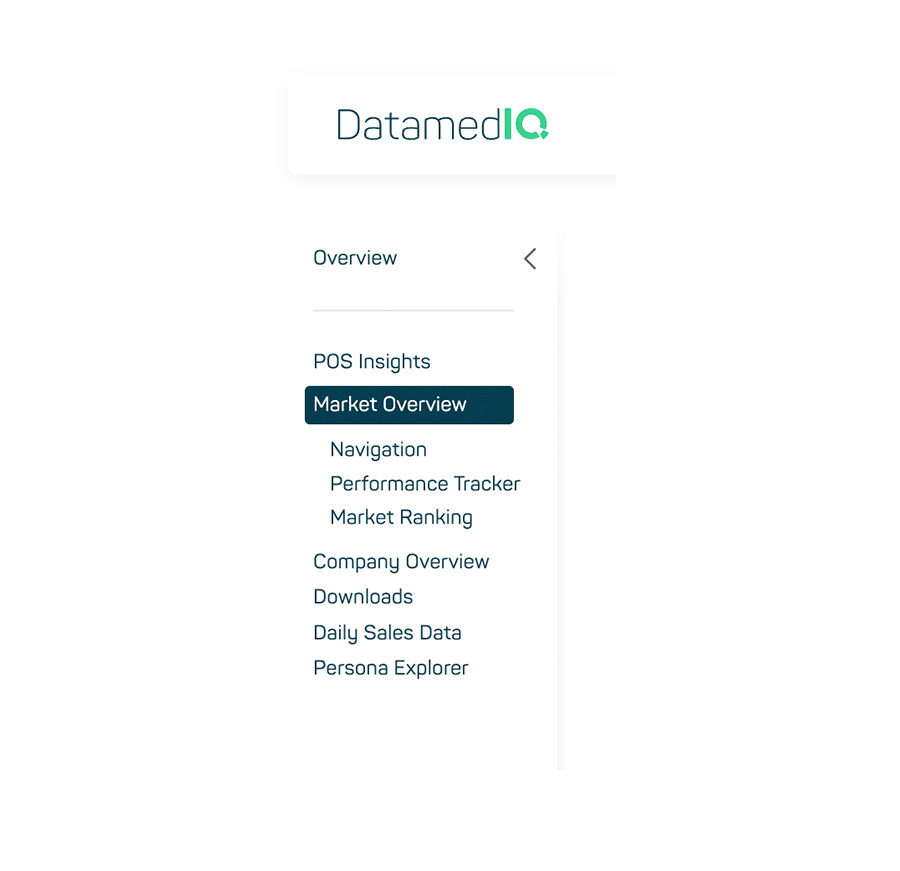
Image 3
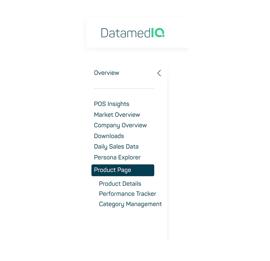
Image 4
Updated Main Navigation
The Main Navigation Bar has also been revised in this iteration. It now stays visible at the top of the page while scrolling. This always gives you quick access to the most important navigation points and the search function.
In addition, the pop-up window that opens by clicking the right button has been significantly redesigned. The new design offers improved usability and a clearer layout so that you can find the desired functions and information more quickly and intuitively (see image 5).
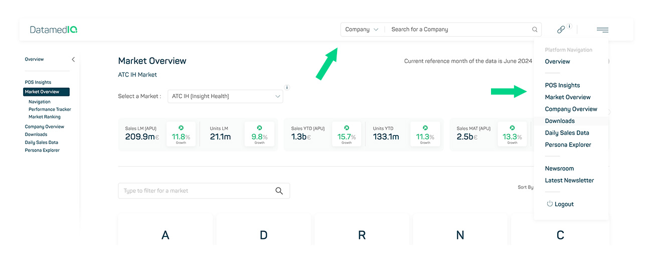
Image 5